install.packages("ggplot2")Visualising Data
Visualisation of data using
ggplot2.
Requirements
For this session you will need to install the packages ggplot2, tidyr, and dplyr.
You can also work with some of the data distributed for the purpose of these sessions (see here).
Graphics with ggplot2
Graphics created with the ggplot2 package have become popular because they are versatile and highly customisable. While basic graphics created with the graphics package lack some automation, such as legend insertion, ggplot2 creates them by default. In addition, ggplot2 graphics can be designed using layers (connected by the + symbol), and the resulting graphics can be assigned to objects and shared as R images.
Some Basic Plots
For example, we can create a histogram showing the distribution of values for petal length (in cm) from the data set iris.
# All required packages
library(ggplot2)
library(tidyr)
library(dplyr)

histogram1 <- iris %>%
    ggplot(aes(x = Petal.Length)) +
    geom_histogram()

# Show the histogram
histogram1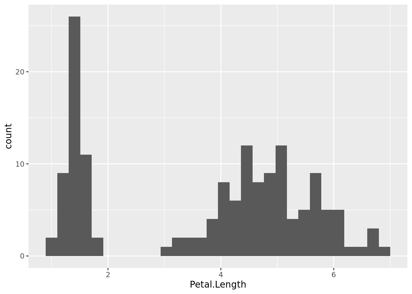
Obviously this pattern is produced by the co-occurrence of data populations in this dataset, for example three species (Iris setosa, I. versicolor and I. virginica).
histogram2 <- iris %>%
    ggplot(aes(x = Petal.Length, fill = Species)) +
    geom_histogram()

# Show the histogram
histogram2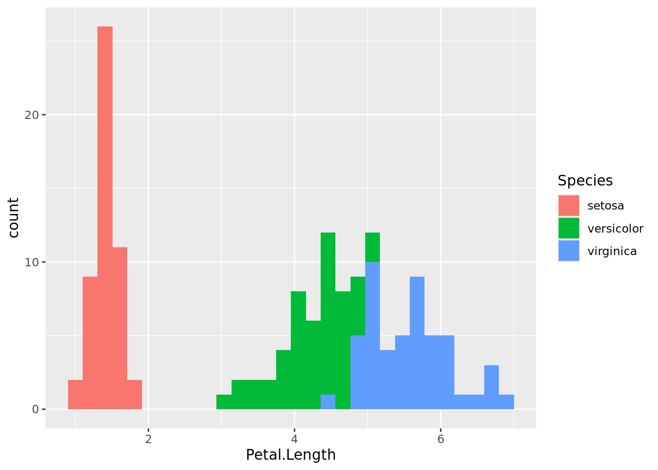
As you can see, I. setosa has contrastingly shorter petals than the other two data populations. With some overlap, I. versicolor has shorter petals than I. virginica. The same can be visualised using box plots.
boxplot1 <- iris %>%
    ggplot(aes(x = Species, y = Petal.Length, fill = Species)) +
    geom_boxplot()

# Show the boxplot
boxplot1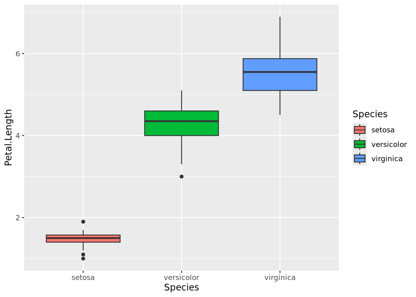
Facetted Plots
Producing faccetted plots may ease the visualisation of multiple data populations in one image. As we know, the dataset iris include records of four different dimensions considering petals and sepals of the flowers and all the measurements were done in cm. We will now to rearrange the table first (see our previous session).
iris_long <- iris %>%
  pivot_longer(
    cols = c("Petal.Length", "Petal.Width", "Sepal.Length", "Sepal.Width"),
    names_to = "dimension",
    values_to = "cm")

# Show the result
iris_long
# A tibble: 600 x 3
Species dimension cm
<fct> <chr> <dbl>
1 setosa Petal.Length 1.4
2 setosa Petal.Width 0.2
3 setosa Sepal.Length 5.1
4 setosa Sepal.Width 3.5
5 setosa Petal.Length 1.4
6 setosa Petal.Width 0.2
7 setosa Sepal.Length 4.9
8 setosa Sepal.Width 3
9 setosa Petal.Length 1.3
10 setosa Petal.Width 0.2
# i 590 more rowsCheck all histograms at once.
iris_long %>%
  ggplot(aes(x = cm, fill = Species)) +
  geom_histogram() +
  facet_wrap(~dimension)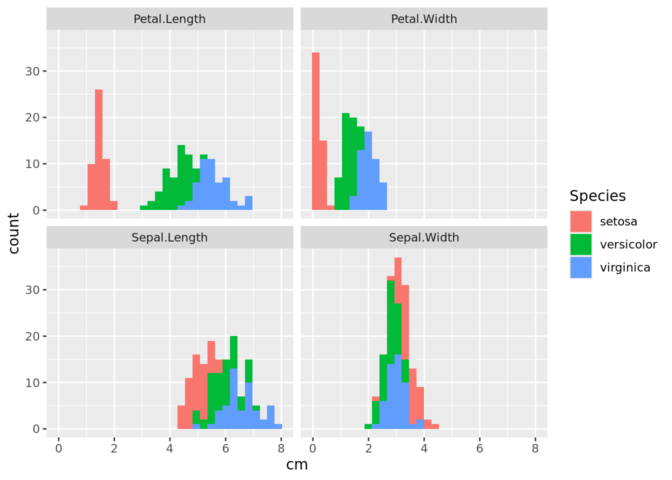
We can see that it is easier to distinguish species by looking at the dimensions of the petals than at the sepals. Now do the same using box plots.
iris_long %>%
  ggplot(aes(x = Species, y = cm, fill = Species)) +
  geom_boxplot() +
  facet_wrap(~dimension)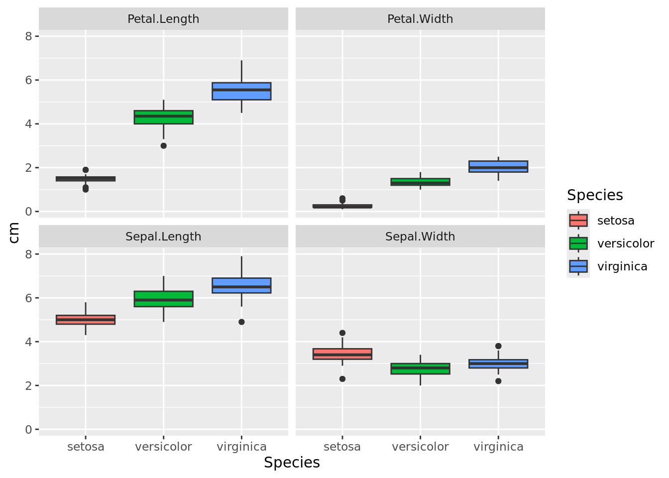
Further References
A great help for designing plots using either graphics or ggplot2 is the R Graph Gallery.
Looking for the best choice of colours for your graphics? Take a look at the R Color Chart.
If you like to impress with interactive graphics, then plotly is your friend. Similar functionality for time series is offered by dygraphs.